Calendar heat maps are the tool that your HR department never knew they needed
A calendar heat map can show ‘hot spots’ for all the events and absences across your whole organisation, or right down to a single person, and every filter that you can think of in between. How would you use yours? Tell us in the comments.
It is a truth universally acknowledged… that heat maps are cool.
Charts, graphs, and reports have their place, sure. But let’s be honest—the word ‘report’ is likely to put most brains into snooze-mode. And the thought of interpreting charts and graphs is about as appealing as kicking back with a volume of unsolved mathematical theorems. Not so with heat maps.
Heat maps are interesting—they draw you in. Like a good whodunnit, everyone wants to know more when they look at a heat map.
And although heat maps for highlighting individual absence patterns are nothing new in HR software, their full potential has never been realised… until now.
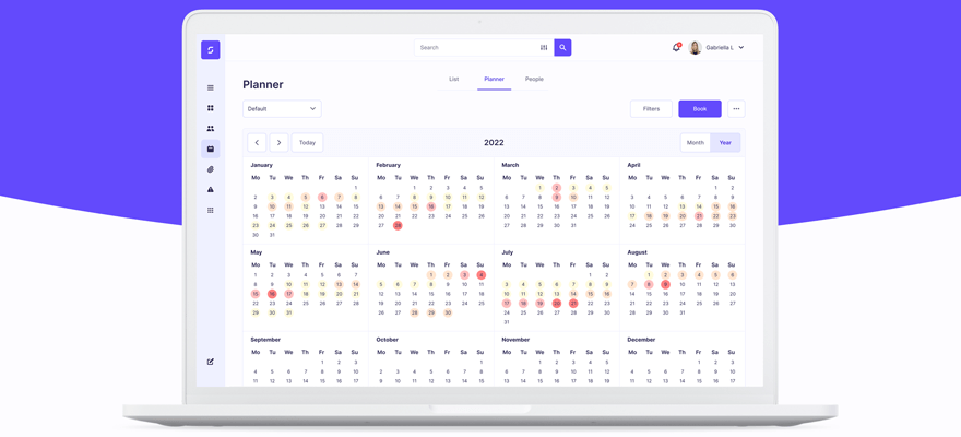
The SenseHR calendar heat map
At SenseHR, we know that heat maps are not only powerful visual indicators, which can tell you more than most charts while using nothing but colours, but they are fun and engaging too. And yet, they are hardly used in other HR software solutions.
The most that other systems offer is a days-of-the-week absence indicator for each person. And we don’t like to judge (much) but these features are more PH strip than heat map.
And we don’t like to brag (much) but our heat map feature is something to write home about blogs about.
Our calendar heat map can show ‘hot spots’ for all the events and absences across your whole organisation, or right down to a single person, and every filter that you can think of in between. Want to look at company-wide holidays? Done. Interested in popular meeting times for the London office? Done. Wondering about sickness absence during England’s Euro semi-final? Well, you probably don’t need a heat map for that, but done. Want to see if Bernie Briggs is busy on Wednesdays? We won’t ask…but done.
OK, sounds fun. But so’s Mario Kart. What’s the point?
A heat map is worth 1000 words
Our calendar and heat map combination uses intuitively shaded cells—you can even use your own branded colours, if you like—to show the relative number of events for each day, week, or month within the calendar view. And that means HR professionals have an instant indication of daily, weekly, and monthly trends, patterns, and anomalies—without having to search for them—which can be used to support further investigation or to report to other stakeholders.
For example, you can use our calendar heat map to identify sickness patterns and to support new absence management initiatives. Say that you wanted to make a case for funding employee flu vaccinations through the winter months. You could turn up to your stakeholder meeting and pull out the charts and graphs and repor… zzzzzzz… sorry, what was that? Or you could flash a heat map for 10 seconds and impart the same information. Because heat map reports are so effortlessly self-explanatory, simplifying the communication of key data down to a coloured cell. Lots of dark red around the winter months = higher rates of absence = job done.
Or they can be used as a basis for future planning. Training courses can be organised during quiet periods. Important meetings can be scheduled for days when there are no conflicts. Teams can be put together according to their availability. In short, you can track and monitor organisation-wide activity in the time it takes to say “Human capital management” … probably faster. So, people managers can accurately gauge activity and availability planning in an instant. And make data-backed decisions quicker than ever before.
On an individual level, heat maps are great way for your people to visualise their own absence data, which can encourage self-regulation of holiday management, improve sickness absence rates, or be the basis for discussing emerging patterns. And for HR professionals, an individual absence heat map can highlight concerning trends. For example, if Dave has the last Friday of every month off, which coincides with a presentation by his team, then perhaps Dave has an issue with public speaking. Or maybe he just wants to celebrate pay day. The point is this; our heat map will show you—and Dave—the trend.
And you can stick with our system settings or through our fully customisable planners and filters, you can set up your heat map to show you the trends, patterns, and anomalies that are useful to you and your organisation. So, the only limits are your creativity (…and, you know, the law).
And, if all that didn’t convince you that your HR department needs heatmaps in its toolkit, then just imagine this scenario: with a heatmap you can narrow down a good date for the Christmas party in roughly 60 seconds. I know. Sold, right? Us too.
